This is not my usual style, but I felt the need to step back and look at the macro picture.
I’m sharing this chart not for trading purposes, but purely as a relative performance comparison.
Order Blocks
-
The reliability of OBs here is limited.
-
Only high-timeframe OBs are meaningful.
-
Existing OBs trigger reactions but fail to generate continuation.
-
The reason is clear: there is no absorption.
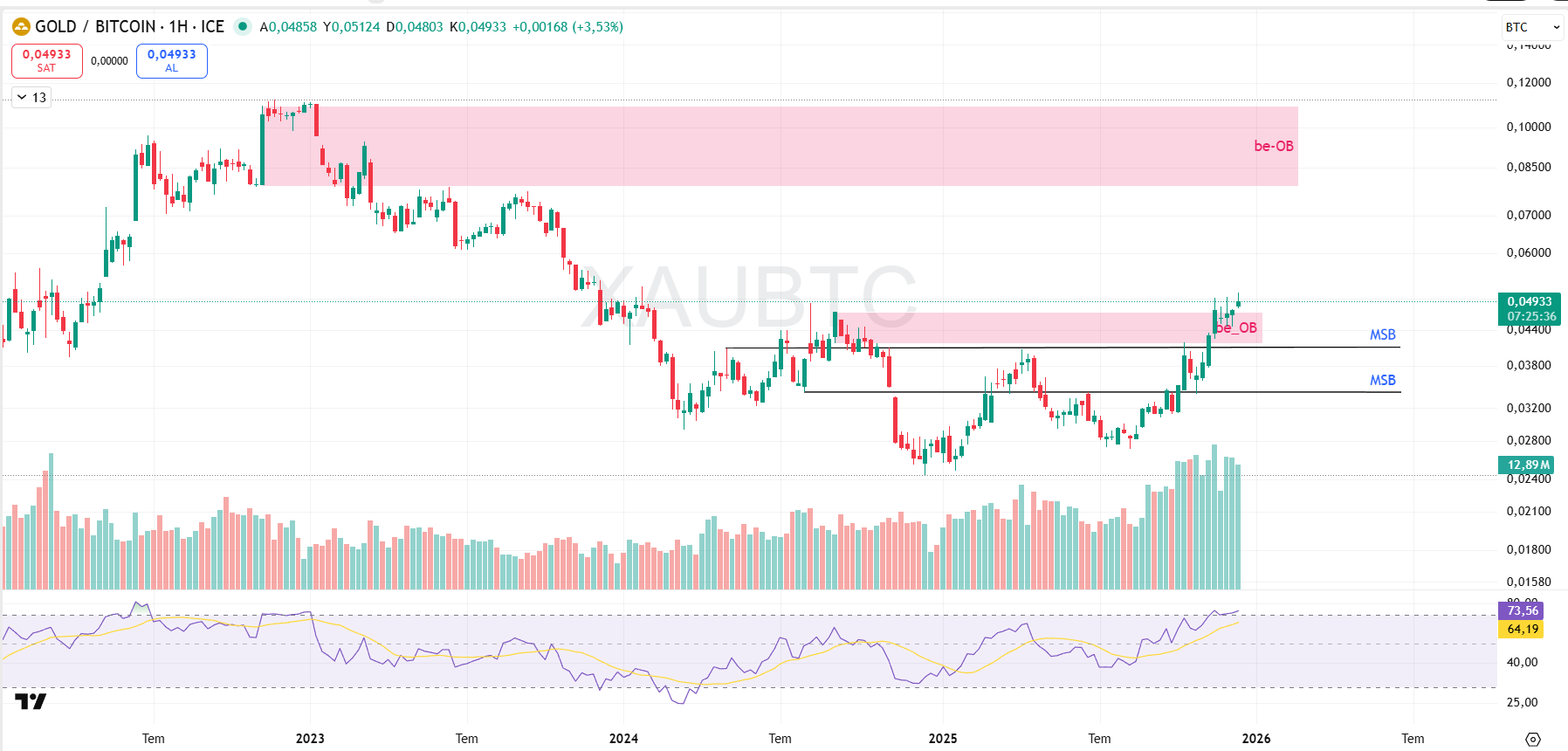
Why is there no absorption?
A) There is selling, but no silent buyer absorbing it all.
Why not?
Because this chart is not a price-discovery or profit-seeking chart.
Institutions don’t use this pair for “buy–sell” trades, but for portfolio balance.
B) Price does not consolidate in a zone to build energy.
C) There is no sharp, one-directional expansion.
D) Movements are mostly back-and-forth.
What the chart says is not “let’s run”, but “let’s rebalance.”
MSB (Not influential on this chart)
-
Produces signals but does not start trends.
-
After MSB, price usually returns back into range.
FVG (Not influential on this chart)
-
Gaps get filled, but they do not create structural direction.
-
They act as touchpoints, not targets.
Liquidity (Not influential on this chart)
-
No crypto-style stop hunts or liquidity sweeps.
-
Movements are driven by macro flows and relative valuation, not microstructure games.
What does it tell us?
-
If XAU/BTC rises: Gold is outperforming Bitcoin
(risk-off, defensive positioning). -
If XAU/BTC falls: Bitcoin is stronger than gold
(risk appetite).
In short:
Rising XAU/BTC = protection.
Falling XAU/BTC = increasing risk appetite.
Bottom line
XAU/BTC is currently reflecting a risk-averse environment, but not a lasting regime shift.
Gold is slightly ahead, but there is no aggressive capital rotation.
Everyone is cautious, waiting, and unwilling to break the balance.
This chart is effectively saying:
“This is not a time for big risk.
It’s a time for protection.”